Telia Play
Lead product designer for unifying Telia Play and C More into a shared streaming system across mobile, web, and TV. Led the system architecture. Component hierarchy, navigation patterns, theming, and usage guidelines.
Platform
Mobile (iOS, Android), web and TV
Timeline
2020-2021
Scope
Unified UX and shared component library for Telia Play and C More. Navigation, cards, rails, and theming.
Constraints
Two mature products, multiple brands, and many devices. Improve UX while reducing duplication.
TLDR
Telia ran two separate streaming services, Telia Play and C More, with duplicated UX patterns and uneven experiences across mobile, web, and TV. We unified them into a shared system with one navigation model and a brand-agnostic component library that reduced duplication and improved cross-device consistency.
Role
Lead product designer. I owned the unified UX system across Telia Play and C More. I defined component hierarchy, navigation patterns, theming, and usage guidelines, and partnered with product, brand, and engineering to drive adoption across teams.
Problem
Telia Play and C More were two mature streaming services with overlapping functionality but different UX patterns and branding across mobile, web, and TV. That created duplicated work for teams and an inconsistent experience for viewers switching between devices.
Outcome
We shipped a unified Telia Play experience and a shared, brand-agnostic component library that powered both Telia Play and C More across devices. This improved cross-device consistency and reduced duplicated design and engineering effort for new features and updates.
Context
Telia operated two separate streaming services, Telia Play and C More. Each had its own UX patterns, visuals and roadmap across mobile, web and TV. The business wanted to move toward a unified Telia Play experience that still supported different content offerings and markets.
Context
Telia operated two separate streaming services, Telia Play and C More. Each had its own UX patterns, visuals and roadmap across mobile, web and TV. The business wanted to move toward a unified Telia Play experience that still supported different content offerings and markets.
Key design tension
Unify two mature services without breaking how viewers already watch.
Key design tension
Unify two mature services without breaking how viewers already watch.
Challenge
We needed to merge two mature products into one coherent streaming service without breaking existing customer habits. The UX had to work across phones, tablets, web and TV, and support different brands and campaigns over time. At the same time we had to reduce duplicated design and engineering effort so teams could move faster.

Approach
I worked with product, brand, and engineering leads to audit both services and map overlapping patterns. We identified the building blocks that showed up everywhere. Cards, rails, navigation, and detail views. From there we defined a component hierarchy and usage rules that could outlive any single campaign or brand. Throughout the process we tested flows on real devices to make sure the system worked in living rooms as well as on laptops and phones.
Principles

Key UX decision
One navigation and rail system across devices.
Key UX decision
One navigation and rail system across devices.
Solution
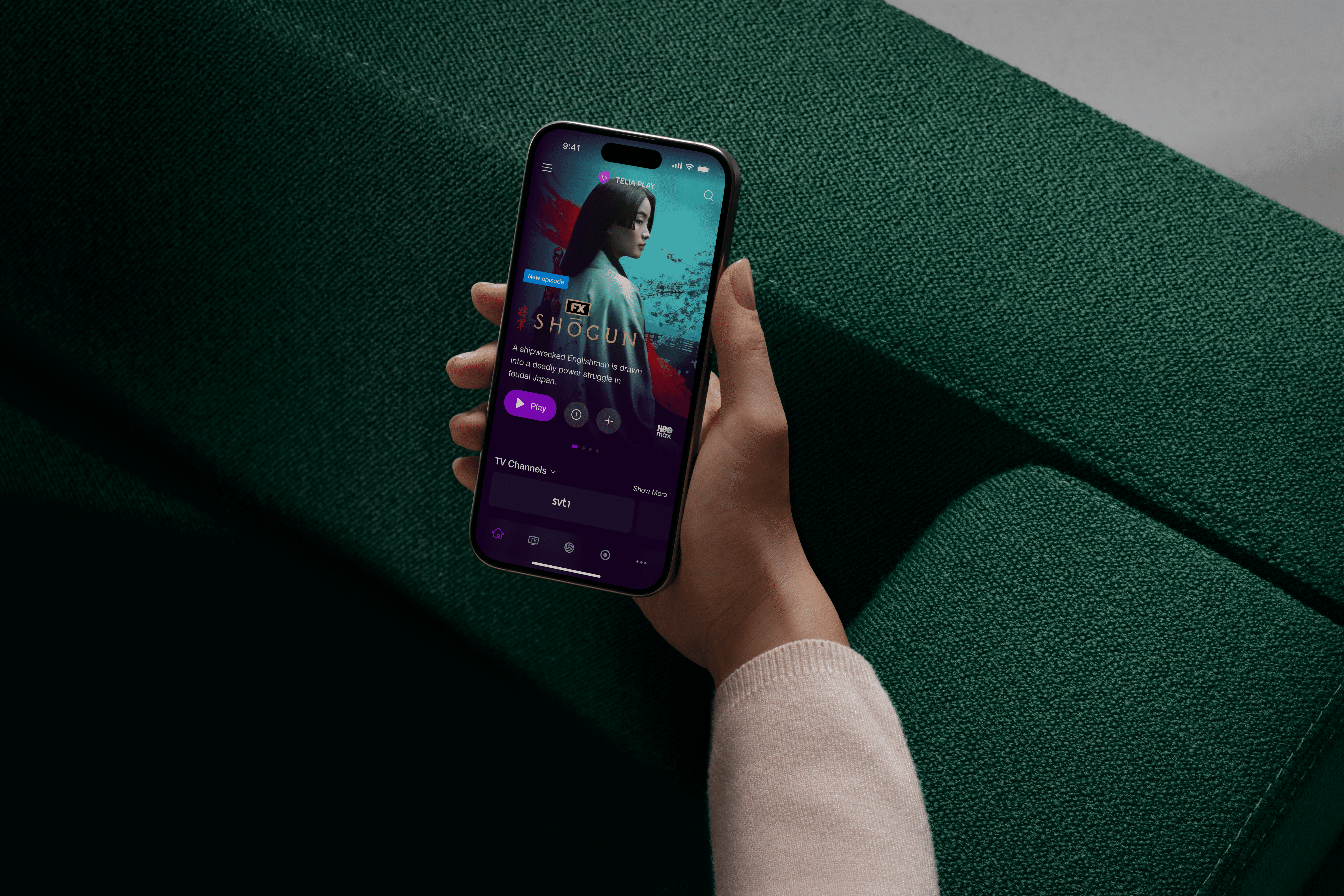
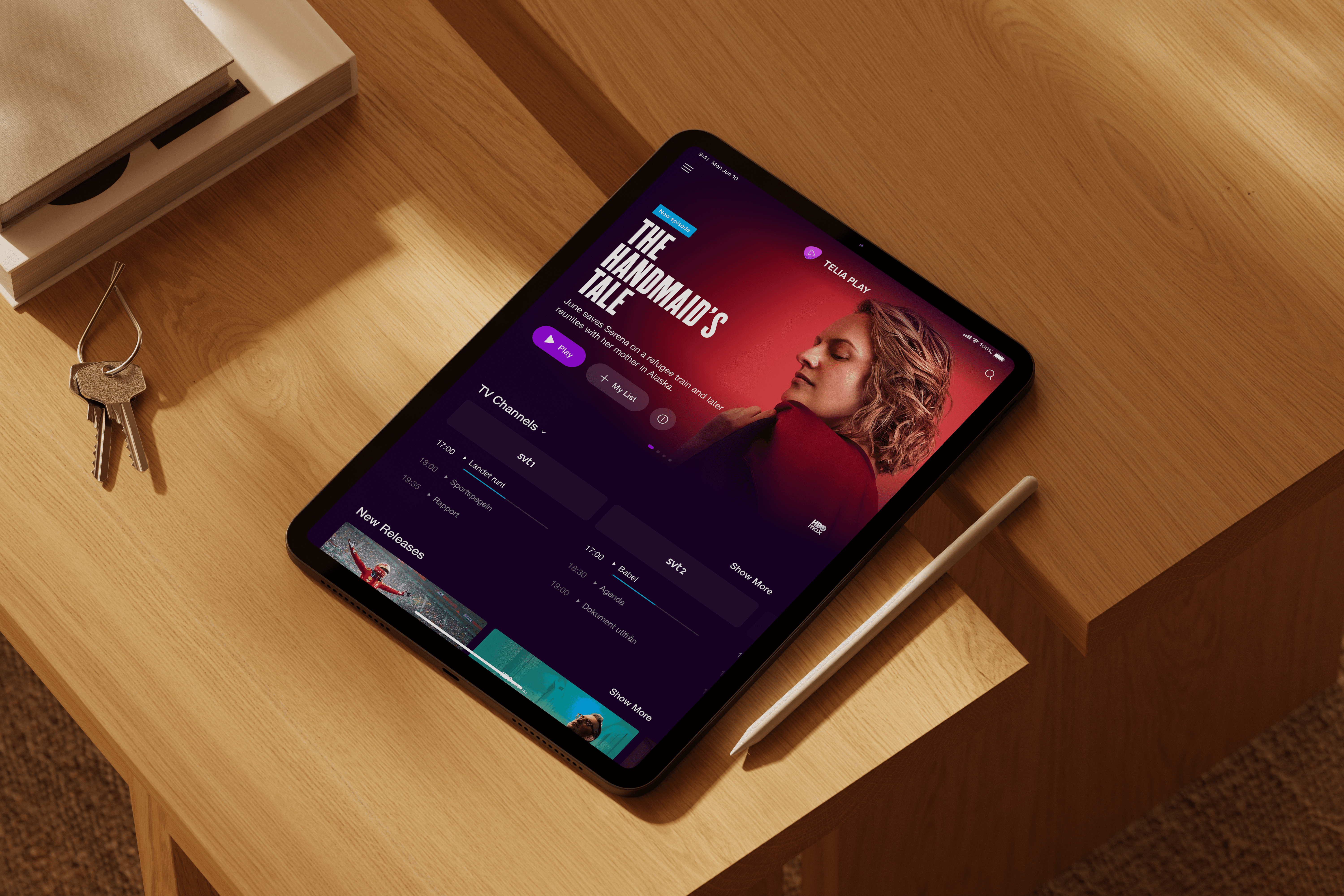
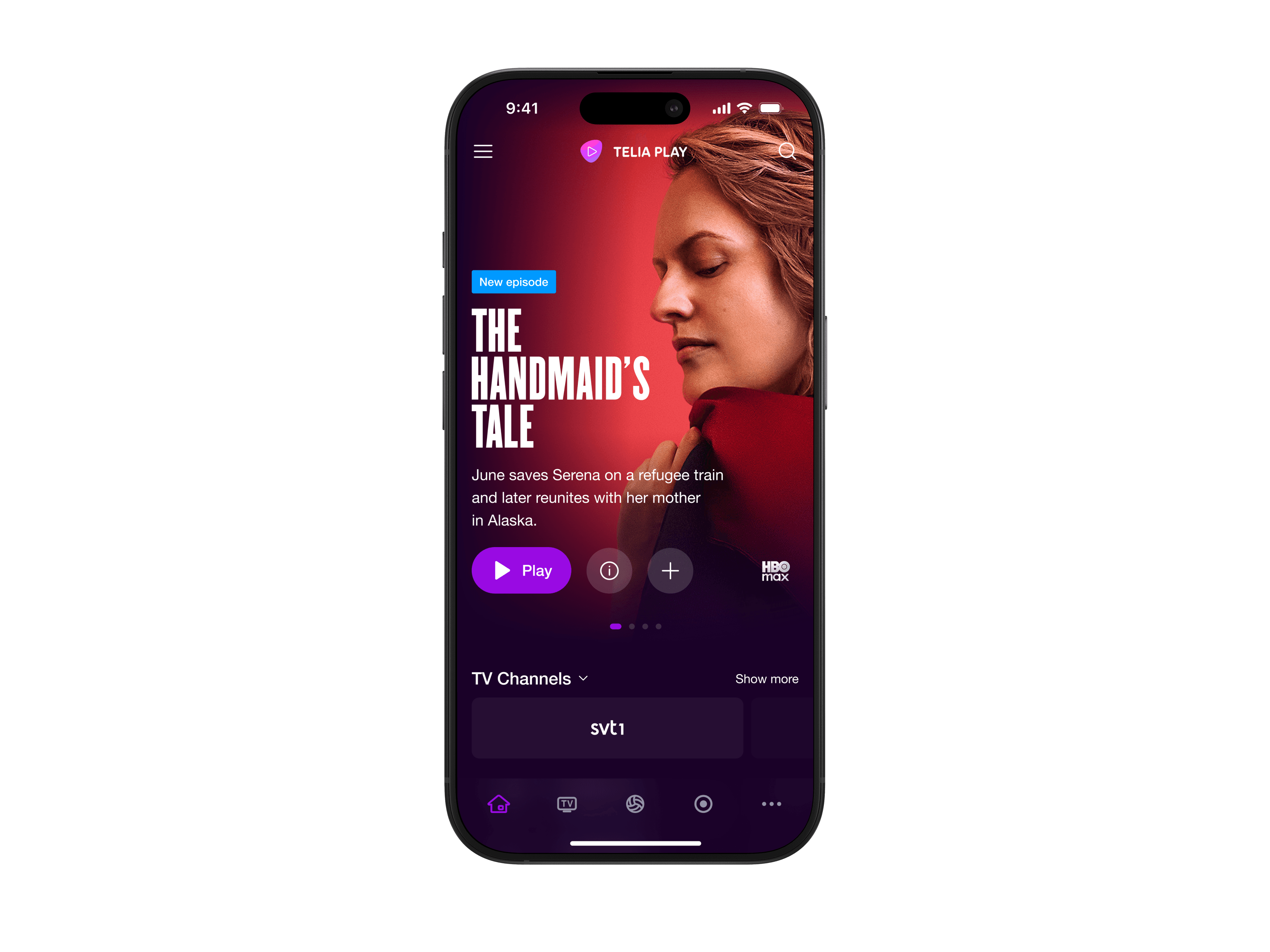
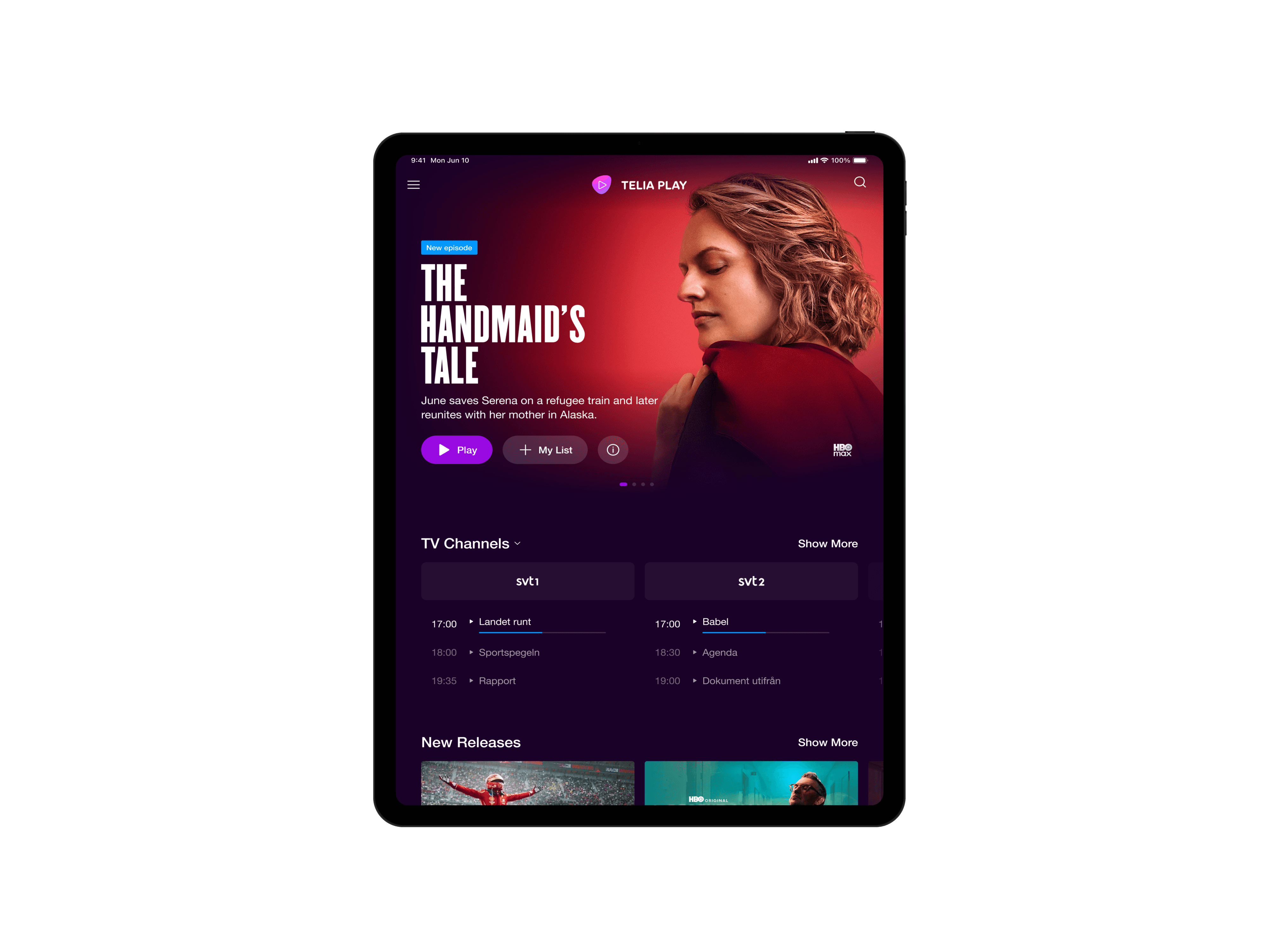
We created a shared, brand-agnostic component library that powered the unified Telia Play experience across mobile, web, and TV. Layout, spacing, interaction, and behavior stayed consistent, while typography, color, and branding could switch through theming. Before, teams solved the same patterns twice across two products. After, one card and rail system could support both Telia Play and C More with only visual changes. Clear guidelines helped feature teams reuse components instead of creating one-off solutions.
One navigation model
We aligned core navigation and viewing flows so switching between mobile, web, and TV felt familiar.
Shared component library
We built reusable cards, rails, navigation, and detail views so teams could ship from a common foundation.
Brand flexibility through theming
Behavior stayed consistent while typography, color, and branding could switch through theming for Telia Play and C More.
Clear usage guidelines
We defined when to reuse, extend, or create new UI so the system stayed coherent as teams adopted it.
Validated across real devices
We tested flows on phones, web, and TV to make sure patterns held up in real contexts, not just in Figma.
What changed
Solution
We created a shared, brand-agnostic component library that powered the unified Telia Play experience across mobile, web, and TV. Layout, spacing, interaction, and behavior stayed consistent, while typography, color, and branding could switch through theming. Before, teams solved the same patterns twice across two products. After, one card and rail system could support both Telia Play and C More with only visual changes. Clear guidelines helped feature teams reuse components instead of creating one-off solutions.
One navigation model
We aligned core navigation and viewing flows so switching between mobile, web, and TV felt familiar.
Shared component library
We built reusable cards, rails, navigation, and detail views so teams could ship from a common foundation.
Brand flexibility through theming
Behavior stayed consistent while typography, color, and branding could switch through theming for Telia Play and C More.
Clear usage guidelines
We defined when to reuse, extend, or create new UI so the system stayed coherent as teams adopted it.
Validated across real devices
We tested flows on phones, web, and TV to make sure patterns held up in real contexts, not just in Figma.
What changed

Key tradeoff
Standardization over one-offs. Built to scale.
Key tradeoff
Standardization over one-offs. Built to scale.
Impact
The unified experience gave viewers a more consistent journey across devices, so switching between phone, TV, and web felt familiar. Internally, teams used the shared library as the default starting point for new features, which reduced duplicated work and sped up releases. We rolled it out across mobile, web, and TV, and brand or campaign updates became cheaper because they could ride on top of existing components rather than trigger full redesigns.
Hard proof

Reflection
This project strengthened how I think about design systems as products in their own right. Investing in a clear component hierarchy and theming strategy let one system support multiple brands and device contexts without fragmenting. If I did it again, I would push tokens and documentation even earlier so adoption by feature teams is faster and more predictable. I have carried these principles into later work in automotive and AI, where consistency, flexibility, and speed all need to coexist.
Explore more
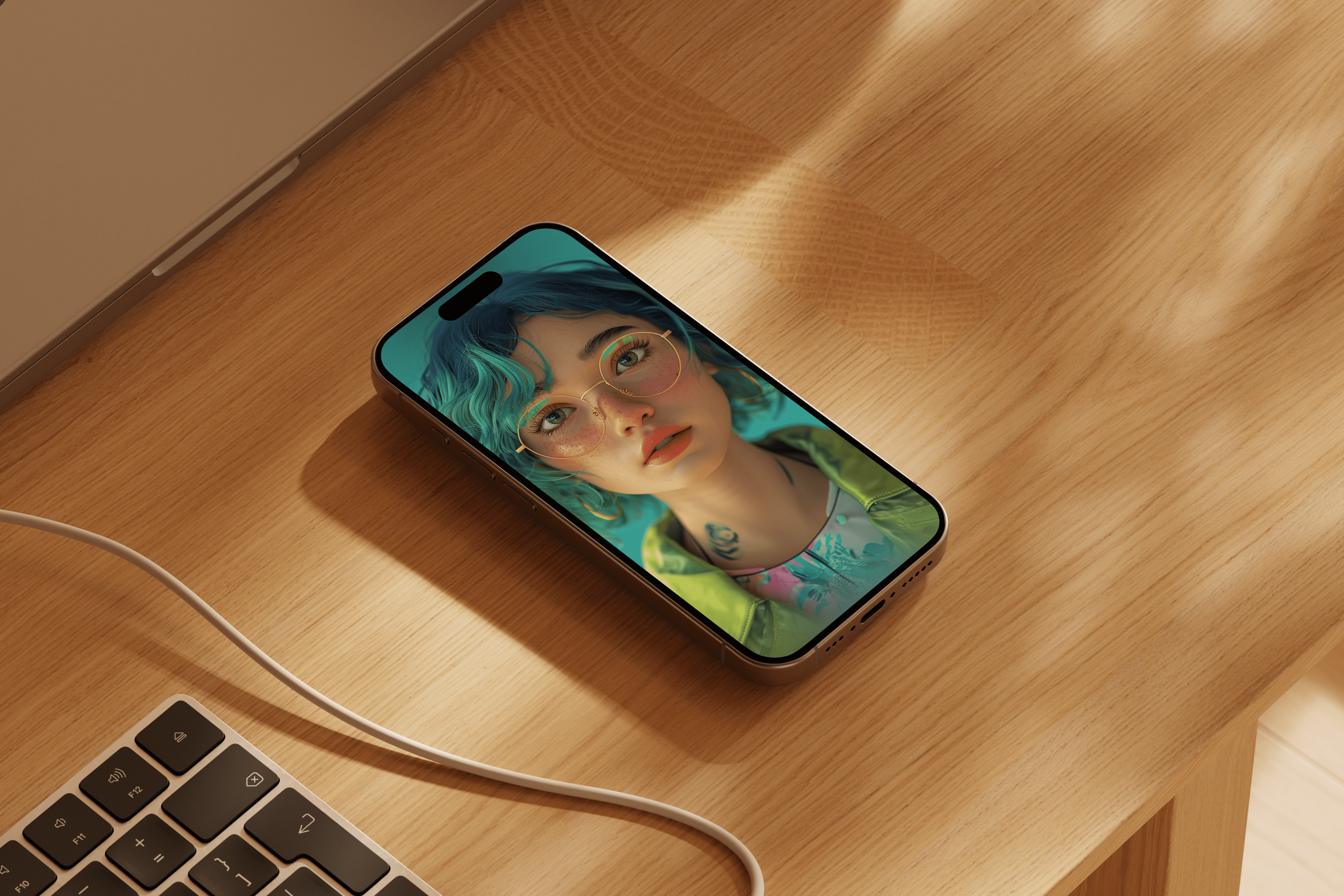
D-ID AI concept
2024
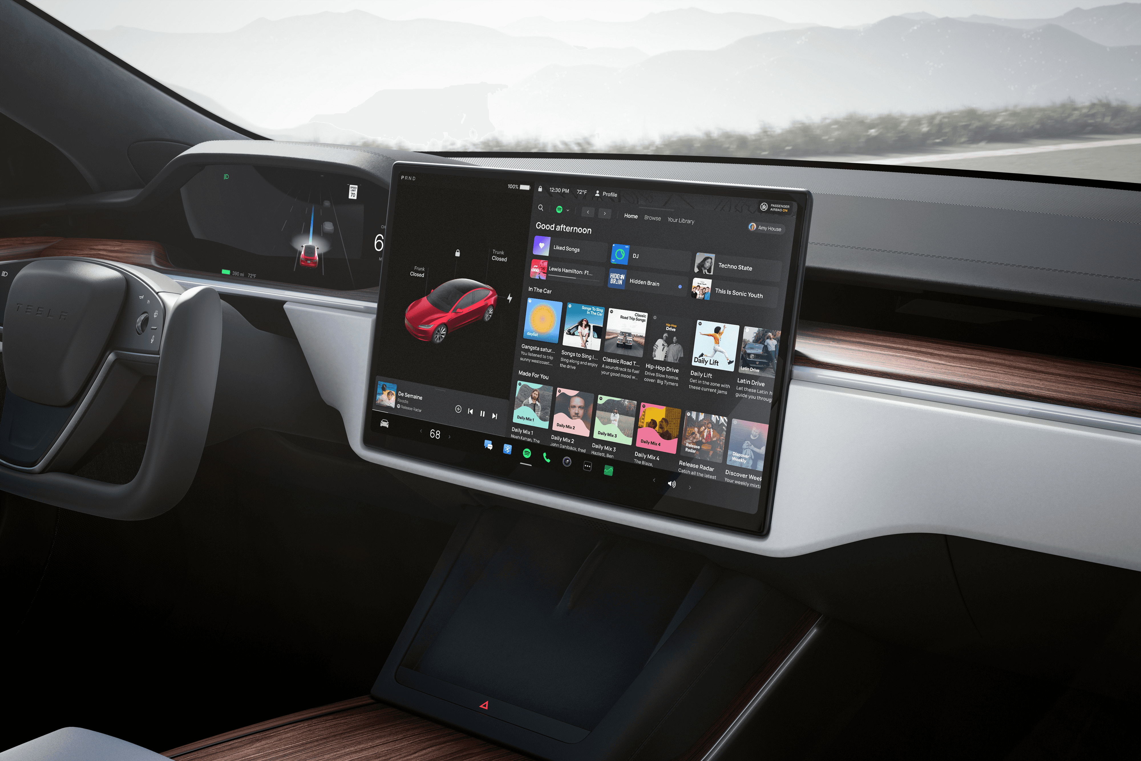
Spotify 2.0 for Tesla
2023
Soundtrack
2018

Spotify Business 2.0
2016

Explore more
D-ID AI concept
2024
Spotify 2.0 for Tesla
2023
Soundtrack
2018
Spotify Business 2.0
2016

Independent Principal Product Designer based in Stockholm, working worldwide. Designing future digital experiences.
© 2026
arnetz.design
Independent Principal Product Designer based in Stockholm, working worldwide. Designing future digital experiences.
© 2026
arnetz.design